How good design makes the difference 🎨
In the world of email marketing, design is more than just aesthetics - it's a key factor in engagement rates. A well-designed newsletter can significantly increase open and click-through rates. 💡
Why is design so important?
An appealing design not only attracts attention, but also makes navigation easier and increases readability. It creates a positive user experience that motivates your readers to interact with the content.
Elements of an effective newsletter design
- 📐 Structure and layout: A clearly structured layout with a logical sequence of elements improves readability. Use sections and visual hierarchies to emphasise important information.
- 🌈 Colours and typography: Colours and fonts should match the brand identity and at the same time promote readability. Avoid using too many different colours and fonts to ensure a harmonious overall look.
- 🖼️ Images and graphics: High-quality visual elements such as images, graphics and icons can make complex information easy to understand and arouse the reader's interest.
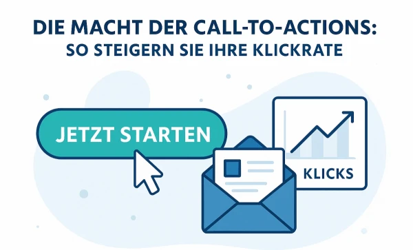
- 🔗 Call-to-action (CTA): Design CTAs to be eye-catching and easily accessible. They should be clearly recognisable and lead the reader to a desired action, be it a click, a registration or a purchase.
- 📱 Mobile optimisation: Make sure your design looks good on mobile devices. Many readers open emails on their smartphones, so the layout needs to be mobile-friendly.
Best practices for an appealing design
- 🧩 Consistency: Keep the design consistent with your brand identity. A uniform style ensures recognition and professionalism.
- ✂️ Simplicity: Less is more. Avoid overloaded designs and focus on clear, uncluttered elements.
- 🔄 Interactive elements: Use interactive features such as animated GIFs or polls to increase engagement and encourage readers to interact.
Practical example:
An online travel portal could use the following newsletter design:
- 🗺️ Large, attractive images of travel destinations that awaken wanderlust.
- 🔖 Clear CTA buttons such as "Book now" or "Find out more".
- 📅 A simple layout with travel offers sorted by theme or destination.
- 🔍 Emphasise reviews and customer testimonials to build trust.
Conclusion:
A well thought-out newsletter design is crucial for the success of your email campaigns. It not only ensures an appealing look, but also improves user-friendliness and increases engagement. Invest in good design and watch your open and click rates skyrocket! 📈
How do you design your newsletters?
#NewsletterGestaltung #EngagementRate #E-MailMarketing #DigitalMarketing #UXDesign


